Current Air Quality Map
Particulate Matter (smoke) monitoring is only available at the Anderson and Redding monitoring stations. The Shasta Lake station monitor for ozone pollution only. Ozone pollution is different than smoke.
The map you see below identifies the permanent, official, air monitoring stations in the north state.
Smoke vs Ozone
It is important to understand that not all air monitoring stations monitor for particulate matter (smoke). In Shasta County, the Anderson and Redding stations are the only stations monitoring for particulate matter (smoke). The Shasta Lake sites only monitor for Ozone pollution which is not related to smoke from wildfires. This is why you may see good air quality being indicated for Shasta Lake when there may be smoke present.
AirNow Fire and Smoke Map
AirNow and the U.S. Forest Service have launched a pilot project to show data from low-cost sensors on the Fire and Smoke Map. The goal of the project is to provide additional air quality information during wildfires – especially in areas with no AirNow monitors. See the map.
Shasta County Air Quality Map
LEGEND:
![]()
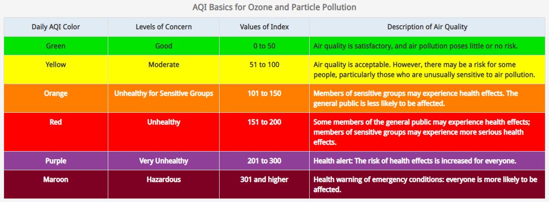
What is the U.S. Air Quality Index (AQI)?
The U.S. AQI is EPA’s index for reporting air quality.
How does the AQI work?
Think of the AQI as a yardstick that runs from 0 to 500. The higher the AQI value, the greater the level of air pollution and the greater the health concern. For example, an AQI value of 50 or below represents good air quality, while an AQI value over 300 represents hazardous air quality.
For each pollutant an AQI value of 100 generally corresponds to an ambient air concentration that equals the level of the short-term national ambient air quality standard for protection of public health. AQI values at or below 100 are generally thought of as satisfactory. When AQI values are above 100, air quality is unhealthy: at first for certain sensitive groups of people, then for everyone as AQI values get higher.
The AQI is divided into six categories. Each category corresponds to a different level of health concern. Each category also has a specific color. The color makes it easy for people to quickly determine whether air quality is reaching unhealthy levels in their communities.